Valora
A mobile app that simplifies cryptocurrency investing, empowering beginners with a secure, accessible, and intuitive experience.
Tools
Figma, Zoom, Google Docs
Timeline & Status
16 weeks
My Role
Sole UX/UI Designer
Overview
Cryptocurrency offers immense potential but remains daunting for many newcomers due to its technical complexities, volatility, and security concerns. Misconceptions and a lack of trust hinder users from fully exploring this evolving financial space. Valora was designed to make cryptocurrency more accessible, intuitive, and trustworthy for beginners, simplifying key concepts and addressing the common fears that prevent users from engaging confidently with digital assets.
The Problem
Many newcomers to cryptocurrency are curious about investing but feel intimidated by its technical complexity, economic volatility, and security risks. These barriers, coupled with a lack of trust and understanding of cryptocurrency platforms, discourage beginners from confidently exploring digital assets as a viable financial opportunity.
The Solution
Valora is a platform that simplifies cryptocurrency investing for beginners by addressing key barriers such as technical complexity, security risks, and lack of trust. It empowers users with an intuitive, secure, and beginner-friendly experience, making digital assets more accessible and approachable.
Key Features:
Simplified Trading Functionality
Secure login with biometric and multi-factor authentication.
Comprehensive Educational Resources
Discovery
01
Secondary Research
To understand the barriers newcomers face in adopting cryptocurrency, I conducted secondary research. The findings highlighted three key challenges:
Regulatory Challenges and Security Risks: Users face risks like theft, volatility, and deceptive advertising. A lack of global regulation complicates decision-making and deters potential users.
Negative Media Perception and Misinformation: Media often links cryptocurrency to illicit activities, fueling skepticism despite recent improvements in transparency and safety.
Knowledge Gaps Among Younger Generations: Many young users feel unprepared and uneducated about cryptocurrency, leading to hesitancy and a lack of trust
Primary Research
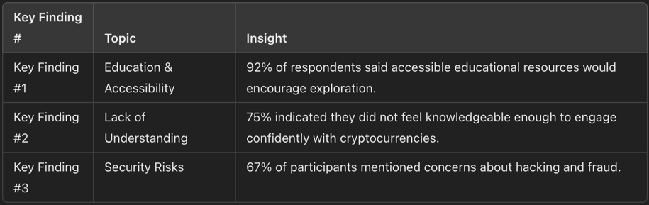
To better understand the barriers to cryptocurrency adoption, I conducted primary research. I built a 15-question survey designed to explore people's experiences and perceptions of cryptocurrency. To ensure relevant data, I included 3 screener questions to qualify participants based on their interest in cryptocurrency and limited prior experience. The survey was distributed to over 10 participants, resulting in 12 responses. This research helped me identify the key factors contributing to fear, uncertainty, and doubt among potential and current cryptocurrency users.
Survey Analysis Key Insights
After analyzing the survey the main factors deterring people from exploring cryptocurrencies are security risks, technical challenges, economic volatility, and a lack of understanding.
Jobs to be done
Based on survey insights, I translated user needs into Jobs to Be Done (JTBD) statements, defining specific goals that the app should accomplish to ensure the design is directly aligned with users' needs. This stage was built upon my previous research identified in the surveys. This helped me further put myself into the user's shoes and prioritize features that improve the user experience.
When I am managing my cryptocurrency assets, I want to know that the platform has robust security features so I can feel confident that my investments are safe from hacking or fraud.
When I want to learn about cryptocurrency, I want the content to be clear and easy to understand so I can feel knowledgeable and reduce my fear of making mistakes.
When I am deciding whether to invest in cryptocurrency, I want to see transparent information about fees and risks so I can feel secure and confident in my decision-making process.
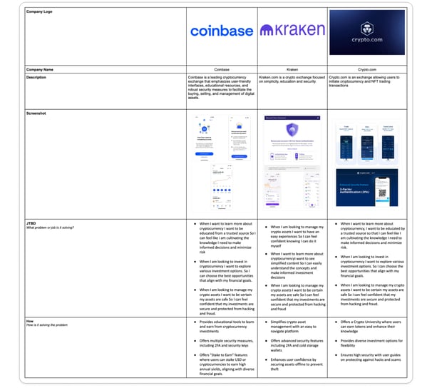
Competitive Analysis
I then performed competitive research of similar cryptocurrency platforms (Coinbase, Kraken, and Crypto.com) to better understand how companies were addressing user challenges in the crypto space. I chose Coinbase for its focus on accessibility and popularity among beginners, Kraken for its emphasis on security and simplicity, and Crypto.com for its diverse investment options and educational features. These platforms all prioritize simplicity for newcomers, robust security measures, and accessibility, while incorporating additional tools like education to build user confidence.
Ideation
02
To address the key challenges identified in my research, I crafted How Might We statements from the perspective of the users. These statements focus on enhancing security and building trust, which were the core needs highlighted by participants. By synthesizing insights from my research, I identified questions to guide my design process.
HMW streamline cryptocurrency platforms to make them more accessible and easier to use for people with limited technical experience.
HMW strengthen security measures to alleviate fears about hacking and fraud while building user confidence in cryptocurrency platforms.
HMW provide clear educational tools that help users understand cryptocurrency concepts and the regulatory environment, reducing uncertainty.
HMW build transparency into cryptocurrency platforms to establish trust and reduce the fear of hidden risks.
HMW create a community-driven platform where users can connect, share knowledge, and support one another.
Problem Statements (HMW)
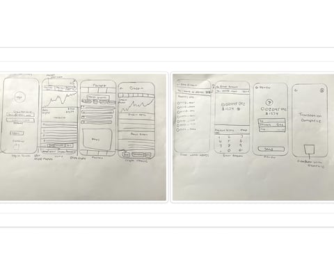
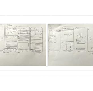
Sketching ideas enabled me to visualize potential solutions and prioritize those that addressed the biggest barriers to cryptocurrency adoption. By considering the HMW statements, I aimed to address the user's core pain points and ensure my solutions aligned with their needs. Some ideas I had were detailed information about each cryptocurrency, and a home screen with a portfolio overview and performance and the options to quickly buy and sell.
Sketches
User Stories
I created user stories to align the design with user needs and clarify requirements for design. I utilized the findings from my research and prioritized these stories into High (Must Have), Medium (Nice to Have), and Low (OK Not to Have) categories to address user concerns.
As a user, I want to use biometric and multi-factor authentication to log in so that I can ensure my account is secure from unauthorized access.
As a user, I want to access a library of educational videos, tutorials, and articles so that I can better understand the economic and regulatory aspects of cryptocurrencies.
As a user, I want to perform straightforward buy and sell actions so that I can manage my investments easily and efficiently.
As a user, I want to receive an introductory guide with videos explaining the platform so that I can feel confident using the platform from the start.
As a user, I want to access a comprehensive tutorial that guides me through the account setup process so that I can create my account smoothly.
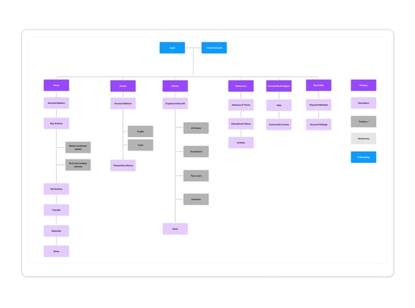
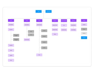
Site Map
I created the site map using insights from user stories to define key user requirements., It helped me translate user requirements into a clear and logical structure by visualizing the overall information architecture and identifying how different features would connect to provide a seamless user experience. It also helped identify areas where the architecture could be enhanced without compromising essential features. This ensured the final design provided an intuitive navigation experience.
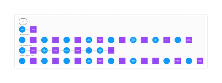
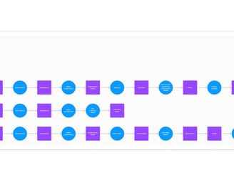
User Flows
I created user flows to visualize the sequence of actions a user would take within the application. This step was crucial for mapping out intuitive paths for users to accomplish tasks like logging in, accessing educational resources, or managing their cryptocurrency assets. The flow diagram helped me identify potential pain points in the user journey and streamline interactions to ensure simplicity and efficiency. It provided a foundation for structuring the app’s navigation and screen layouts, directly influencing subsequent activities like sketching and wireframing. This ensured that every screen aligned with user goals and supported a seamless experience
Design
03
Wireframes
Building on the user flows, site maps, and sketches, I created low-fidelity wireframes in Figma to establish the app’s fundamental structure. These wireframes focused on core functionality and layout, allowing me to validate the app’s architecture and refine the overall user journey.Moving to medium-fidelity wireframes, I added more detail by incorporating typography, spacing, and basic interactive elements to create a more polished and functional representation of the app. This progression revealed opportunities to improve visual hierarchy and user interaction, which I iterated on to create a more seamless and engaging experience.
Mood Board
To define the app’s identity, I created a brand platform that included the name, mission, vision, and core attributes. I chose "Valora" to reflect value and trust, aligning with the platform’s goal of empowering users and simplifying cryptocurrency interactions. I curated a mood board with visuals that captured the brand’s approachable and trustworthy personality. By focusing on cohesive color schemes, typography, and UI elements, the mood board guided the aesthetic direction and ensured that all visual elements reinforced Valora’s mission of accessibility, trust, and simplicity.
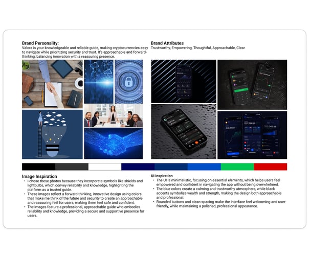
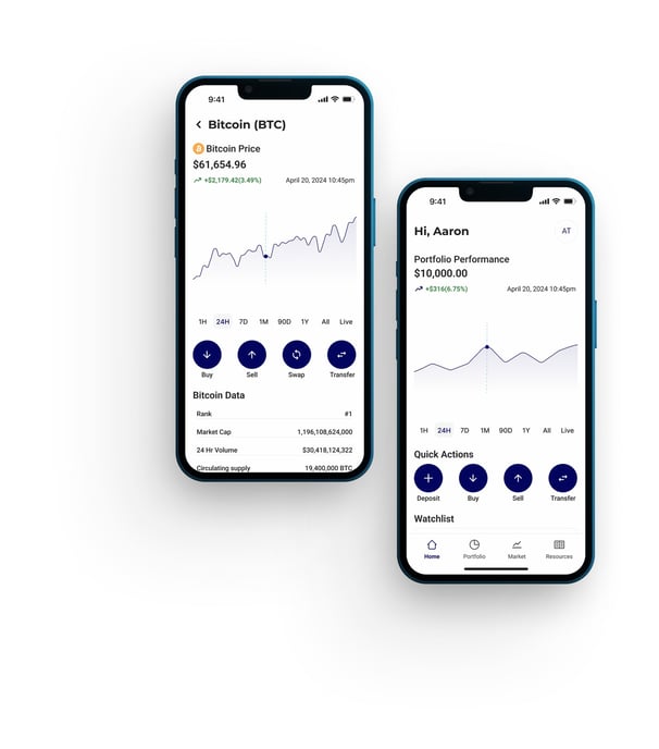
High-Fidelity Screens & Prototype
With my hi-fi screens, it was time to breathe life and color into my designs. Drawing inspiration from my competitive analysis, I aimed for a clean, simple, yet engaging aesthetic. The meticulously crafted style guide, infused with warm yellow and calming blue tones from the mood board, guided the visual direction of my screens—creating an ambiance of welcoming tranquility and clean simplicity. Elements from the low-fidelity screens, such as the category layout on the Calendar screen, evolved from cluttered text to a sleek and intuitive schedule.
To further refine the user experience, I used Figma to transform these screens into a clickable prototype. This interactive model allowed me to step into the user's perspective, simulating real interactions and identifying areas for improvement. By refining button interactions and screen transitions, I enhanced the overall usability, ensuring a seamless and intuitive experience.
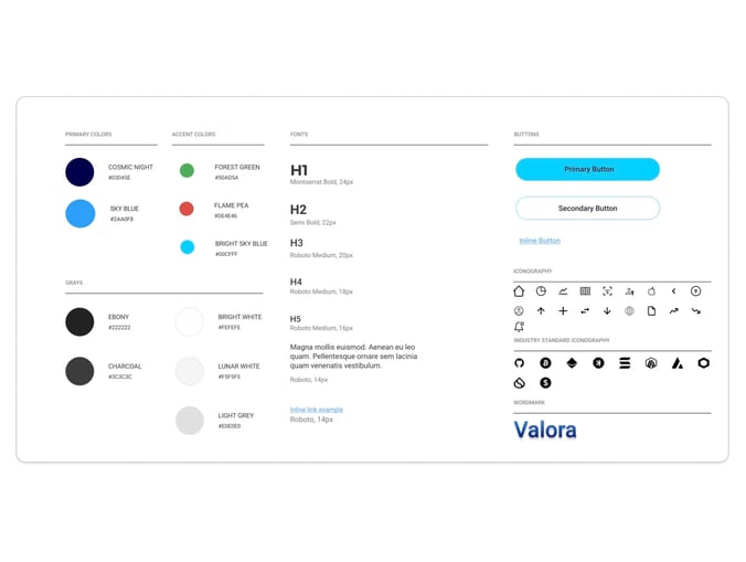
Style Guide
I created a style guide to establish a consistent visual language and ensure the app’s design reflected the brand’s identity. This step was essential for defining typography, color schemes, button styles, and iconography that aligned with the platform’s mission. By codifying these elements, I ensured that the guide was cohesive and minimized inconsistencies during future iterations. The style guide also allowed me to focus on user needs by ensuring the visuals complemented the app’s usability without overwhelming the experience.
Testing
04
Usability Testing
I conducted five remote usability tests via Google Meet and Zoom to evaluate the app’s ease of use and identify areas for potential improvement. Participants were recruited through community channels and personal networks, focusing on individuals who had limited experience with cryptocurrencies but expressed curiosity or reservations about digital investments.
The usability tests aimed to uncover any issues that might hinder user interaction with the app. Participants were asked to complete tasks such as purchasing Bitcoin, viewing their transaction history, and transferring cryptocurrency to an external wallet. The testing revealed several areas for improvement, including visual differentiation in transaction history, redundancy in Quick Actions, and ambiguity in transaction terminology.
Key findings included the need for clearer visual indicators in transaction history (e.g., color coding and symbols for positive and negative balances), streamlining Quick Actions to improve efficiency, and updating terminology to align better with user expectations. Recommendations focused on enhancing clarity, reducing redundancy, and incorporating more descriptive labels to improve the user experience.
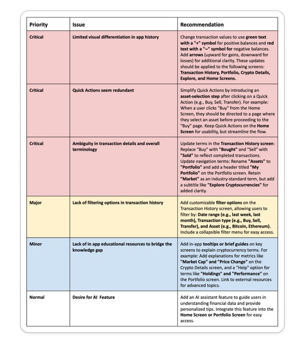
Before:Terms like "Buy" and "Sell" confused users when viewing completed transactions. Vague labels like "Assets" also added to the confusion.
After:"Buy" and "Sell" were replaced with "Bought" and "Sold" in transaction details. "Assets" was renamed to "Portfolio," with clearer subtitles added throughout the app for consistency and user understanding.
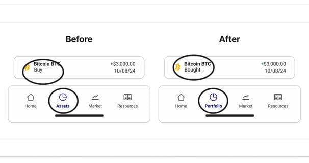
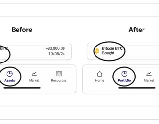
Issue 2: Ambiguity in Transaction Details and Terminology
Redesign
Before: Users found it difficult to distinguish between positive and negative balances due to the absence of visual differentiation
After: Positive balances and price actions are now displayed in green with a "+" sign, and negative balances and price action in red with a "−" sign, improving readability across key screens like Transaction History, Portfolio, and Home
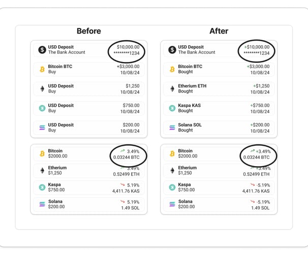
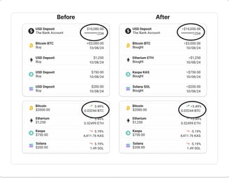
Issue 1: Limited Visual Differentiation in Transaction History
Before: Quick Actions duplicated the navigation options, causing redundancy.
After: Quick Actions now lead users to a new screen which has a more streamlined flow: they select an asset before being directed to the action-specific page (e.g., Buy, Sell, Transfer)
Issue 3: Revised flow V 2.0
Reflection
05
This project reinforced the importance of gathering user feedback at every stage of the research and design process. I learned that even subtle changes, such as color coding or terminology updates, can have a significant impact on user experience, especially in a space as complex and intimidating as cryptocurrency.
The evolving nature of the cryptocurrency industry further emphasizes the need for designs that are adaptable, inclusive, and accessible to users of all knowledge levels. For mass adoption to become a reality, it's essential to consider a broad spectrum of user needs and lower the barriers to entry.
One of my key takeaways was the value of designing with empathy. My personal and professional experiences in the cryptocurrency space greatly influenced this project. Having been involved in crypto for some time, I’ve had the opportunity to discuss it with friends, family, and colleagues ranging from seasoned investors to complete beginners. These conversations not only inspired the project but also helped me connect with the diverse perspectives and challenges users face. This dual perspective allowed me to identify gaps and design solutions that cater to both experienced users and those new to cryptocurrency.
In the future, I plan to continue developing this project as the cryptocurrency space evolves. With new trends and technologies emerging, I aim to integrate additional features that enhance user education, security, and engagement. The process of improving accessibility and trust in crypto platforms remains an exciting challenge, and I hope to keep iterating on this design to make digital assets more approachable for everyone.